Welcome
Welcome to my AS Foundation Portfolio. Here you will find research and planning, construction evidence and evaluation for my Foundation Portfolio.
Tuesday, 11 October 2011
Monday, 10 October 2011
Print Prelim Final Product
The front cover and contents page below are the end results of creation via the use of software Adobe photoshop and Indesign. The front cover was actually produced on photoshop and then transfered onto Indesign in order to save the image with the contents page; the contents page was created entirely using Indesign, because of these two variations in production the background colour for each page is slightly different although this was not intentional.
With the front cover I used a technique of it appearing almost child friendly and cartoon-like as the masthead uses a mix of bright colours, unusual for a display aimed at a primary audience composed of teenagers. The subtext to the right of the masthead and scrolling down the page is a preview of the contents page, for this I drew inspiration from a newspaper column layout. The main image is edited to duplicate the model in order to appeal to young people who are just starting college, it suggests that despite the large numbers everyone was in exactly the same situation.
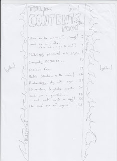
For the contents page I used a layout with similar colour scheme to the front cover in order for some sort of imagery to remain consistent throughout. Inspiration for the contents page came from stereotypical 1960s american homicide police reports, the central page text designation and the layout of the title text is near identical and at least follows the same pattern. The yellow sections of text are used simply to highlight a quick caption of what is located on that page.
Thursday, 15 September 2011
Wednesday, 14 September 2011
Monday, 12 September 2011
Covers and Contents Pages of Inspiration
Below are examples of front covers and contents pages that I'm taking inspiration from for my prelim.
I like this front cover because it is unique, effective and makes the reader curious about the content before they even open the magazine to the first page. The masthead remains exactly the same in every issue, with the exclusion of the issue number. The main image is the only image on the front cover and is also fairly basic whilst managing to provide a successful horror genre feeling to it.
This contents page is effective because it uses a style that most magazines don't adopt, instead of just having a listing of the pages it has them in an appropriate and interesting layout. The magazine that this contents page is from is based on video game entertainment so the layout is made in a way that their target audience will immediately recognise the reference.
I like this front page for the same reason I like the first one, it is effective and makes the reader curious about the content. It is quite unusual however because the masthead is partially covered by the main image, considering the genre and assumed content of the magazine however it is quite effective.
This is more of a 'standard' contents page but is still effective as it uses a variety of images to acompany the text. On the larger of all the images there is also an enlarged page number which is showcasing one of the biggest stories in the magazine so the reader can go straight to that page if they wanted.
Brief: Print
Prelim exercise - using DTP and an image manipulation program, produce the front page of a new school / college magazine, featuring a photograph of a student in medium close-up plus some appropriately laid out text and a masthead. Additionally you must produce a mock-up of the layout of the contents page to demonstrate your grasp of DTP.
Main Task - The front page, contents and double page spread of a new music magazine.
A minimum of 4 images must be used. All images and graphics must be produced by candidate.
Main Task - The front page, contents and double page spread of a new music magazine.
A minimum of 4 images must be used. All images and graphics must be produced by candidate.
Subscribe to:
Comments (Atom)


